Sketches of a mobile-friendlier Metakaolin
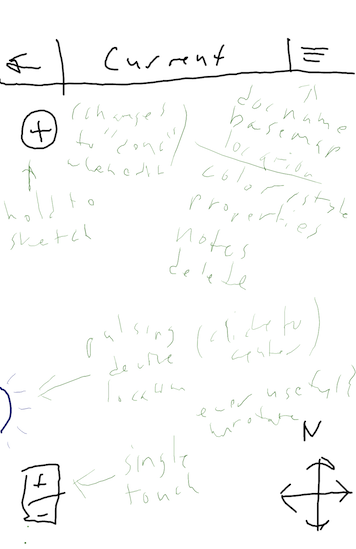
Sketched out some interface ideas for making a better overall experience for Metakaolin on mobile, right on my tablet instead of my usual pen and paper. Even harder to read my writing (I used my Cosmonaut, but without being able to rest one's palm a stylus isn't much help) but on the other hand it's a bit easier to share the ideas online. Still working out which bits to implement for the first "offline" iteration, but here's a handful of ideas I'm excited to implement at some point:

The first idea comes inspired by a great patch by Brian Mount. I'd like to add a "+" button that simply adds a single point in the center of the map when tapped, but when held lets you just sketch out shapes with your finger! This is a refinement from Brian's demo, since it retains the original editor's modelessness, which is its most important property. The interaction on desktop will likely need a modifier key to retain the intended quasimodal design.
The next thing I'm excited about is showing the current location for reference. The idea being that if you're out on site and want to adjust shapes relative to your device's built-in GPS reading it will be displayed live on the map underneath your vectors.
The rest is pretty basic adjustments to the layout and touch target size fixes. I'm not quite sure how well this design will scale up, off of mobile onto a large desktop screen, but I may take some ideas from the recent Android Action Bar interface element and unoverflow items out of the menu into the bar when there's more real estate. A few other items (i.e. the zoom control) would ideally only show up if/when needed (i.e. single touch device).
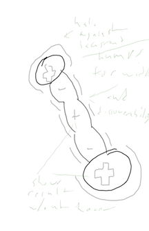
One key touch target adjustment is the editing interface itself. Currently the perceived affordances that would lend intuitiveness to the simple but relatively powerful interface are weak on desktop, and almost completely missing on direct touch devices where there is no hover feedback. I think by enlarging the width of connections in a bit of a creative way, I'll be able to tackle two problems simultaneously: making the lines easier to grab and refine, and making that interaction easier to discover in the first place.

The trick here will be drawing those "bumps" programmatically, but I think it will be worth the extra coding effort. The node side of things gets a little TLC too, better showing the temporarily sticky add vs. normal move state. After practicing with the large grab handles to sketch more real shapes on the map (instead of cartoon ships and trucks!) it's also clear they should be made as small as still practical and perhaps a bit less opaque so they don't cover the basemap as much. While I'm implementing a less "lines and circles" barebones display it'll be a good idea to add a soft contrasting halo around the shapes as well. This would serve both to increase the touch hit area and to make sure the drawing stands out above any basemap terrain/background color.
I'm not terribly happy with the native-app-mimicky appearance that some elements of the overall design seem to imply, as I believe the web is (or at least should be) its own platform. Even as it goes mobile and offline, I don't want Metakaolin to become a cross-platform app — it should be a web app. What that looks like and what that means, especially considering that this is manipulation software for which no browser provides any standard/native controls, is another topic that I still don't claim to be halfway qualified to write about yet. I hope, though, that the fruits of this concern can remain apparent as Metakaolin — and Shutterstem and others — continue to develop.
